Fireplug
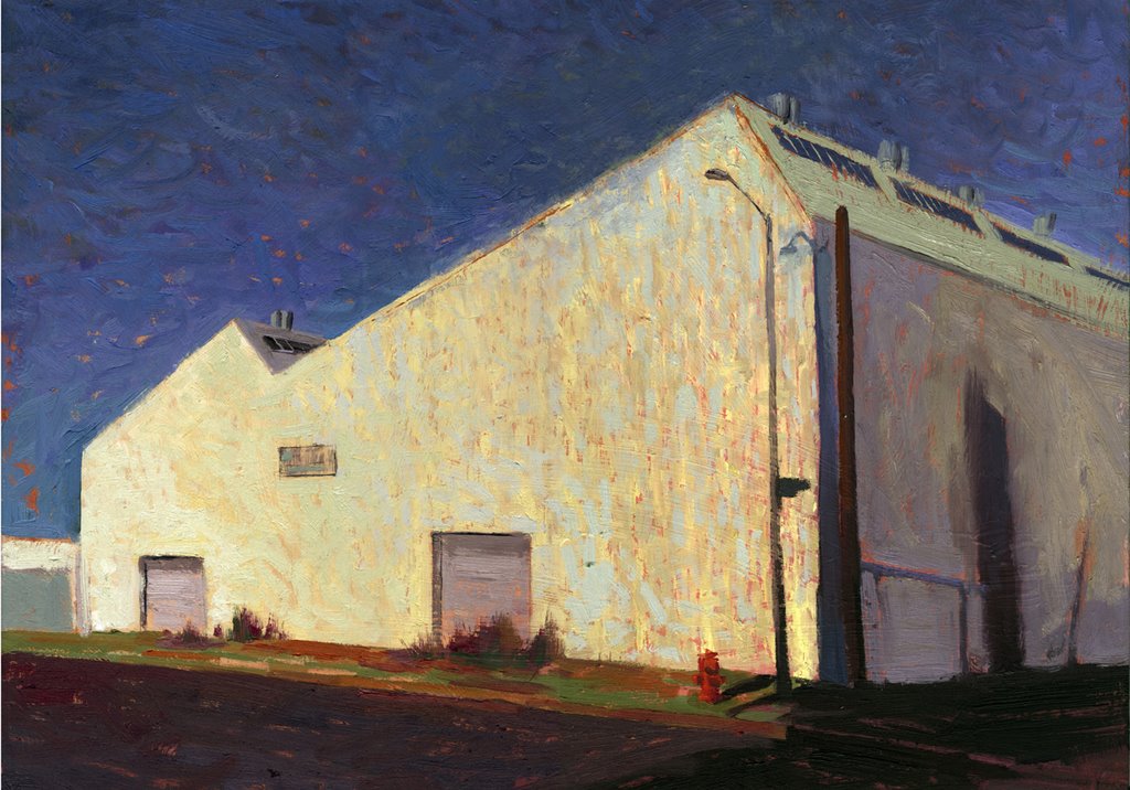
18x24 oil on wood
This is in that same industrial area East of Chinatown and West of the LA River I'm fond of painting in. The location is really irrelevant this time as I made little attempt to identify this with any realistic light of the area and cropping the camera so tight It's hard to get a sense of where you are. I liked the shape of the building and the bright light hitting it. This one was an exercise in my version of "Broken Color" Impressionism. So this is about complementary colors, shape and little brushstrokes. I going to enter this in an Impressionism contest just to get rejected.
posted by william wray at 6:40 PM
![]()
![]()

15 Comments:
Woah, I am enjoying how solid that thing looks, and yet how the painting also reads as flat shapes.
Very Tangible and oddly abstract.
Good show!
I think this is modern and painterly at the same time, really nice work!
man I can't keep up with all this bloginess!
Great painting! It's stark, but the composition is so ass kicktastic, that it works swimingly!
I actually see the complements. It looks like, judging from your description, you did exactly what you set out to do with this one! The way you did the sky makes it look a little like water, I think it's cool. By the way, it seems you left a skylight open there...
Jesse,
Yeah buildings with strong lines can do that.
thanks Erich, I enjoyed your bitter sweet memories of Iwo.
What positive thinking you have there. Great abstract! You might check the P though...but then that isn't on your list.
Hey BG, You saw that eh?
Hey Robin-- It's a little late for that.
Nice serrated edge.. breaks up the sky into a most interesting shape. Your skill shows through in handling the large wall shapes and keeping them interesting. Diagonals galore... Pussy's sister ;-)
Amazing how that blue and yellow melt into each other. From observation of your paintings, I've noticed that you can liberally use colors (moreso than I thought before) as long as they're in the same value structure/saturation. Rudimentary painting classes told me that compliments push, but that's obviously not always the case. Vilpuu is right I guess... No rules, just tools.
Your blog is a color theory class. Cheers!
thanks WK and a big Rim- shot back at you. Batta - Bing!
Katz-- the art class was not totally worng. It's a matter of how you ballance them. A fine line.
Nice vibration on the sunlit wall--yellow/orange and blue. great shapes, too.
I have to say I'm very fond of this one. I love the sure lines the building, the more saturated color palette and the vibrant energy of the technique. Everything is working in concert. Very nice.
Post a Comment
<< Home