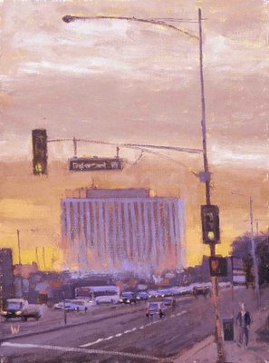
Rosemead Blvd.

Here a bigger on Oil on Canvas 18x24 this is a main street (Rosemead Blvd. right where Arcadia/ Pasadena/ Sierra Madre meet. This one has the most normal commercial brochure looks to it of any painting I've done, maybe an unconscious effort to interest corporate America or curry favor with Ken Auster?
Saw a great show today of Raimonds Staprans at the Pasadena Museum of California art. This guy is so modern in a good way he kills me.


14 Comments:
Ken Auster, eh? Another Laguna Beach fellow. Always liked his work. This one is great Bill. I like this direction. I don't see the Ken in it but I do see a very appealing color sense and take on an urban environment. It's very pleasing to look at and not as angsty as a lot of your other works. It's different. Angsty isn't a bad thing, it's very appealing - but this is appealing on a different level. It's a complementry view on a subject. I think it has legs, as some might say.
thanks Dan, I think...
I like your stuff better than the modern guy.
That's just me tho. :D
Man, you make me wanna crack the turp open...
thanks ree, but you really need to see the stuff in person. The added bonus for me is it helps me see where I can get more simple and modern.
Fantastic work. I like Ken's work a lot as well, but I like the amount of movement you have in color, I don't think simple and modern is necessarily better. I have to say I agree with ree.
Noah
Thank you Noah,
I had another fried say maybe I should go as hard edged as RS for a modern look. That funny because I've spent the last year or two learning how to lose hard edges, so I don't think I'm getting out the masking tape to soon. I do like the idea of simplifying and uniting masses more, my goal is to have the best of both world, using what I like about abstraction and realism together. I think realism comes naturally to people so the part I have to learn is the abstraction.
I understand your feeling when you say this guy is so modern and it kills you, his work is quite abstract in a way, I love this too, simple and strong, using abstract patterns, I never really have the guts (and the skills probably) to do it or to go that far in my work.
Your oil above is beautiful William, I think even when you do some slighlty more commercial paintings as you said, you still manage to have a lot of personality and feelings in your work, I wouldn't mind this one above my desk! he he he.
This comment has been removed by a blog administrator.
You make a good point about not being able to personally take abstraction as far, but you can admire it. I think it’s hard to abstract something even if you want to try it, unless you copy this or another approach totally. It’s a lot harder to change your style than people think. I laugh to myself when I hear about an artist afraid to look to closely at another artists work for fear of corrupting there own style. Little do they know how hard it is to change.
Wow these are really cool. Something in his geometry reminds me of Euan Uglow. Very cool indeed.
I jsut checked out Euan Uglow. I like his work , now if I can find an aforadble copy of his book.
Feels good.. reminds me of Wayne Thiebaud... like his stuff.. these make you wanna paint because it just looks like fun!
Thanks Tim,
I just discovered Wayne, thanks.
... kills me too, damned...
hans
Post a Comment
<< Home